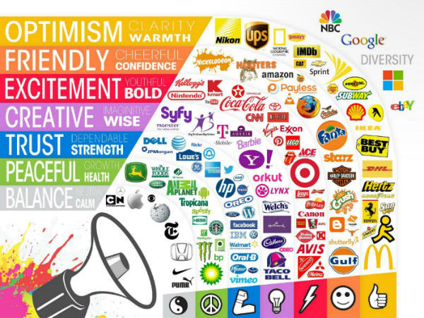
Can the color of your logo really affect your brand’s perception? Maybe… It hasn't been proven that consumers pick certain brands just because of a color preference; however, colors are proven to translate feelings and emotions. See the color emotion guide below provided by The Logo Company.

When it comes to picking the right color for your brand, sometimes its common sense. You wouldn’t expect the Barbie brand to be black and orange, just as you wouldn’t expect Harley Davidson to be pink and purple. Humans naturally associate certain colors with certain attitudes, but for brands that serve large markets (like oil & gas companies) don’t have such an easy experience deciphering their brand colors. Let’s use BP as an example, they have a bright yellow and green logo. Studies show that consumers associate the color green with peace, health and prosperity, all qualities that BP wants to depict, especially after the 2010 oil spill.
Brand Identity
Additional studies have proved that human brains prefer recognizable brands, further giving emphasis to brand identity. Consumers relate to the image of Coca-Cola, it is comforting, universal, and familiar. In taste tests, consumers don’t always pick Coca-Cola as their favorite soda; however when checking out at the supermarket, it’s the traditional red branded soda in their cart. Because of brand identity, new brands struggle to achieve familiarity and reliability among consumers. New brands must ensure their logo differentiates their product from the classics, but not too different that consumers won’t venture out from their old standbys.
